# HTML Picture Element Responsive Images
Today we'll be looking at the `HTML Picture element`. It can be used to have native responsive image support.
So how it works is we wrap our normal `img` tag inside a `picture` element and add `srcset` images.
This will then be defining on media queries which image it shows.
## HTML Picture Element
Ok, let's get started!
For this example, we will be using extreme cases, normally you would just use a modified version of your original image but in a smaller size or different orientation.
```html
```
Now on we should see the following:
- Screen above 650px - Corgi on a mountain
- Screen between 465 and 650px - Corgi on the stairs
- Screen smaller then 465 - Puppy Corgi!
Now isn't that amazing!
> To make this function even better, add [loading="lazy"](https://daily-dev-tips.com/posts/image-lazy-loading/).
Feel free to view these Corgis on Codepen.
%[https://codepen.io/rebelchris/pen/JjXKzWb]
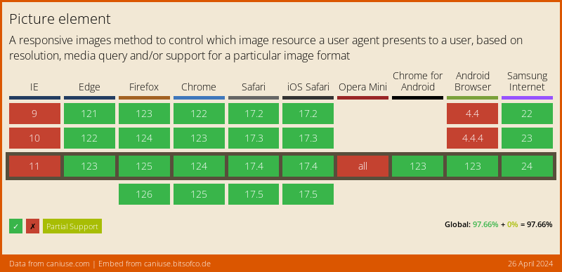
## Browser Support
A super cool feature, but not supported by IE and Opera mini as expected.
However! They will fallback to the default image! So no real objection to using it!
### Thank you for reading, and let's connect!
Thank you for reading my blog. Feel free to subscribe to my email newsletter and connect on [Facebook](https://www.facebook.com/DailyDevTipsBlog) or [Twitter](https://twitter.com/DailyDevTips1)
