


Today we will be building some tooltips with nothing more than CSS. The idea is we hide the tooltip, and we will show it once hovering over the div.
Note: These tooltips must have a fixed width to work!
HTML Structure
As for the HTML, we use the following setup:
<div class="skills">
<div class="skills-item">
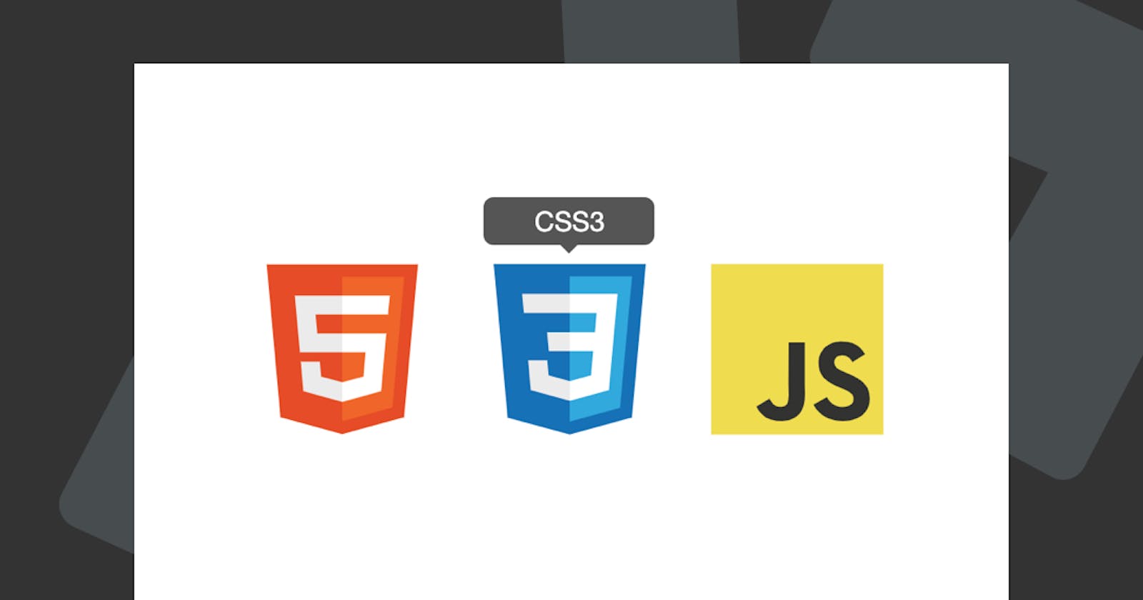
<span class="tooltip">HTML5</span>
<!-- Content -->
</div>
<div class="skills-item">
<span class="tooltip">CSS3</span>
<!-- Content -->
</div>
<div class="skills-item">
<span class="tooltip">JavaScript</span>
<!-- Content -->
</div>
</div>
This will give us a basic grid like setup!
CSS Only Tooltips
As for the CSS which is going to be the main part of this article, we will use some basic styling to style the boxes next to each other.
.skills {
  display: grid;
  grid-template-columns: 1fr 1fr 1fr;
  max-width: 50vw;
  margin: 0 auto;
  height: 100vh;
  align-items: center;
}
.skills-item {
  background: #fff;
  padding: 10px;
  margin: 5px;
  position: relative;
  border-radius: 5px;
}
This is our basic template; we are using a basic grid solution and center the elements.
Let's now style the tooltip:
.skills-item .tooltip {
  width: 100px;
  background-color: #555;
  color: #fff;
  text-align: center;
  padding: 5px 0;
  border-radius: 6px;
  position: absolute;
  z-index: 1;
  bottom: 100%;
  left: 50%;
  margin-left: -50px;
  opacity: 0;
  visibility: hidden;
  transition: opacity 0.3s;
}
The main important parts here lay in the default hidden structure; we also add a transition so it will animate once we hover.
Now we will also add a small triangle in the center, just a touch of extra CSS
.skills-item .tooltip:after {
  content: '';
  position: absolute;
  top: 100%;
  left: 50%;
  margin-left: -5px;
  border-width: 5px;
  border-style: solid;
  border-color: #555 transparent transparent transparent;
}
So now let's move on to making it actually show!
.skills-item:hover .tooltip {
  visibility: visible;
  opacity: 1;
}
That's it. We can now view our awesome tooltip in action.
View it on Codepen.
Thank you for reading, and let's connect!
Thank you for reading my blog. Feel free to subscribe to my email newsletter and connect on Facebook or Twitter