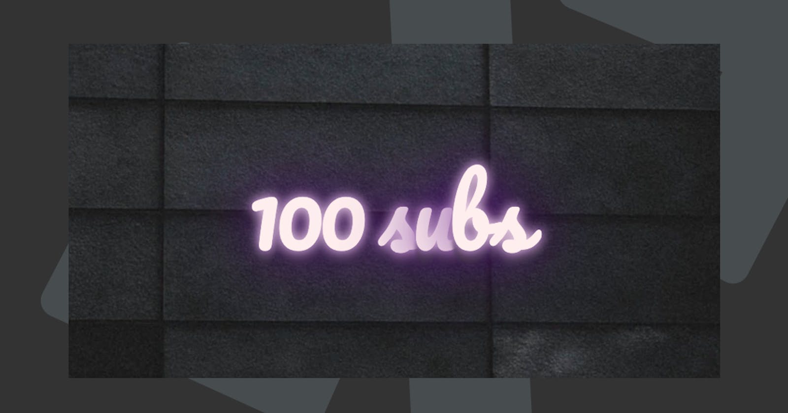
Guys! Thank you all 🥳, I've hit a 100 subscribers to my Newsletter and I'm over the moon!
It means a lot to me that people choose to read my articles and subscribe to receive my email every day, from the bottom of my heart: Thank you! 🧁
Therefore I wanted to make a cool 100 subs CSS neon animation to celebrate.
See below for what we'll be building today, this amazing CSS Neon Animation
HTML Structure
As for our HTML we need the following structure:
<div class="container">
  <div class="text">
    <b>100 s<span>u</span>bs</b>
  </div>
</div>
We are going to use the container to center everything and use the span to make a cool neon glitch.
CSS Neon
First we are going to import a cool Google font, which looks like it could be used in Neon letters.
@import url(//fonts.googleapis.com/css?family=Pacifico);
The on to our Neon effect!
.text b {
  font: 400 25vh 'Pacifico';
  letter-spacing: -5px;
  color: #fee;
  text-shadow: 0 0px 10px, 0 0 1em #560a86, 0 0 0.5em #560a86, 0 0 0.1em #560a86,
    0 10px 3px #333;
}
As you see, we are setting our font to be the Google Font, and making it a font-weight of 25vh (25% Viewport Height.
Then we are using the text-shadow to make it show as Neon. We add multiple glow "layers" and end with a dark grey to make it appear thicker.
Note: You can use a cool tool like this for creating text-shadows
CSS Neon Glitch Animation
We added a glitch on the u letter. This is common in Neon, and we can re-create this using CSS Animations.
.text b span {
  animation: flicker linear infinite 2s;
}

@keyframes flicker {
  75% {
    color: inherit;
    text-shadow: inherit;
  }
  76% {
    color: #222;
  }
  77% {
    color: inherit;
    text-shadow: none;
  }
  78% {
    color: inherit;
    text-shadow: inherit;
  }
  79% {
    color: #222;
    text-shadow: none;
  }
  80% {
    color: inherit;
    text-shadow: inherit;
  }
  90% {
    color: #222;
    text-shadow: none;
  }
  90.5% {
    color: inherit;
    text-shadow: inherit;
  }
}
The actual animation is a mix of resetting the color and removing the text-shadow for a split second; this gives it the appeal of flickering.
Thank you for reading, and let's connect!
Thank you for reading my blog. Feel free to subscribe to my email newsletter and connect on Facebook or Twitter

