


In this article, I wanted to look at the slack logo, I had this logo in my head for the past couple of days, and this is quite an interesting one as it's one of the views that work well for a grid-based layout.
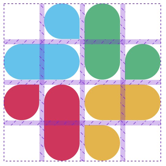
This is the logo I'm talking about:

Analysing the logo
As you might have seen, this logo can easily be broken up into squares, where some of the elements span over two of them.
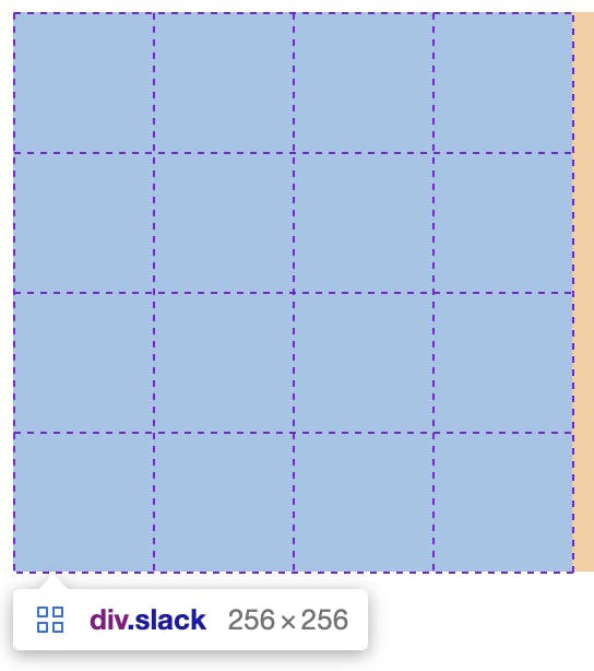
Here is a screenshot of the finished product with the grid active.
We can set up a grid and use some generic styles to re-use some of the elements' layouts.
Let's get right into it and see how this works.
Creating the Slack logo in CSS Grid
.slack {
  width: 16rem;
  aspect-ratio: 1;
  display: grid;
  grid-template-rows: repeat(4, minmax(0, 1fr));
  grid-template-columns: repeat(4, minmax(0, 1fr));
}
This will create the primary grid that we can start filling up with our pieces.
Let's get started on the top left blue item section first.
In our HTML, we can add the following elements.
<div class="slack">
  <div class="blue small"></div>
  <div class="blue big"></div>
</div>
Since every pill is rounded technically, we can add that as one styling element for all divs.
.slack {
  & > div {
    border-radius: 9999px;
  }
}
Note: The above and some code below will be SCSS code
Then we can start positioning our elements on the grid. The simplest one here is the bottom one, as that should span over two columns and sit on the second row.
.blue {
  background: #36c5f0;
  &.big {
    grid-row: 2;
    grid-column: span 2;
  }
}
As you can see, we set this element to be on row two and span over two columns.
We can do something similar for the small one, but not round the bottom right corner.
.blue {
  &.small {
    grid-column-start: 2;
    border-bottom-right-radius: 0px;
  }
}
So far, we should have the following look:

But, we can quickly see it's too smooshed together, so let's add a gap to our grid.
.slack {
  gap: 0.5rem;
}
Now we can add the other three sides and position them accordingly. The main thing that changes is the column/row start and end and which border we turn off.
<div class="slack">
  <div class="blue small"></div>
  <div class="blue big"></div>
  <div class="green small"></div>
  <div class="green big"></div>
  <div class="red small"></div>
  <div class="red big"></div>
  <div class="yellow small"></div>
  <div class="yellow big"></div>
</div>
And for the CSS dump, please check this CodePen to see what's happening.
Do note there are multiple correct ways of determining the column/row start and end.
Thank you for reading, and let's connect!
Thank you for reading my blog. Feel free to subscribe to my email newsletter and connect on Facebook or Twitter