# CSS Aspect Ratio it's finally here
If you're a front-end developer, you must have looked up "CSS Aspect Ratio" more than once.
One of these things one would expect to be existing in CSS for a long time, but it was not! (Well, not really)
There are [some hacks](https://css-tricks.com/aspect-ratio-boxes/) to achieve it.
But not a proper aspect-ratio solution, until now that is!
Chrome just got support for the `aspect-ratio` property.
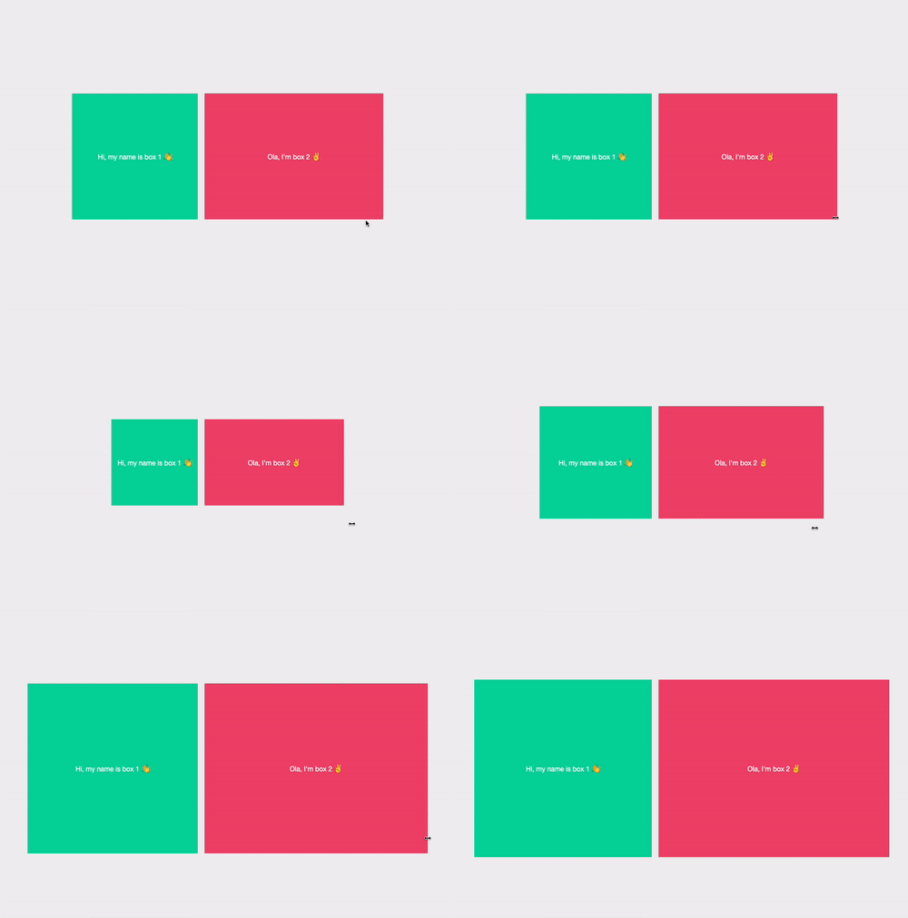
To give you an example of how it works:
## Using the CSS aspect-ratio
The syntax for the `aspect-ratio` is pretty simple.
```css
aspect-ratio: width / height;
```
Alternatively you have some CSS basics like:
```css
aspect-ratio: inherit;
aspect-ratio: initial;
aspect-ratio: unset;
```
To test it out, let's make a resizable box to test out how it will work.
```html
```
Inside of the container, we will place two boxes that will have their own aspect ratio's
Box 1 will have an aspect ratio of 1/1
And Box 2 will have a 16/9 aspect ratio.
```html
```
First, we'll start by styling the container. We want it to wrap the elements inside but add the [CSS Resize property](https://daily-dev-tips.com/posts/making-divs-user-resizable-with-css/).
```css
.container {
display: flex;
gap: 16px;
resize: horizontal;
overflow: auto;
}
```
Then we can move to our generic box styling. This will be the styling that each box will get.
```css
.box {
display: flex;
align-items: center;
justify-content: center;
font-size: 1.5rem;
color: #fff;
}
```
As you can see, this is mainly used to center the content inside the boxes and give them a bigger font.
Now onto the magic part 🪄.
### CSS square aspect-ratio 1/1
For our first box, we will use a square aspect ratio. We can achieve this by using the following CSS.
```css
.box1 {
aspect-ratio: 1 / 1;
background: #06d6a0;
flex: 1;
}
```
This will provide us a square box that can grow in size.
### CSS rectangle aspect-ratio 16/9
The second box will have a 16/9 aspect-ratio, which we can achieve by the following CSS.
```css
.box2 {
aspect-ratio: 16 / 9;
background: #ef476f;
flex: 1 0 auto;
}
```
Now we get the following result as you can test out in this Codepen.
> Note: Browser support is not big, so you might not see it behave as expected. I've added the GIF, in the beginning to showcase how it works.
%[https://codepen.io/rebelchris/pen/JjRgaQx]
## Browser Support
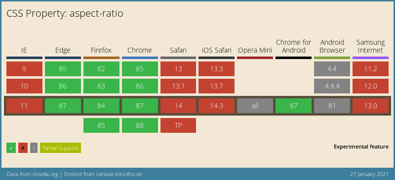
It's still very early days for the `aspect-ratio` browser-support. Chrome shipped it in production in version 88, and Firefox has it in beta, so you can enable it in Firefox.
### Thank you for reading, and let's connect!
Thank you for reading my blog. Feel free to subscribe to my email newsletter and connect on [Facebook](https://www.facebook.com/DailyDevTipsBlog) or [Twitter](https://twitter.com/DailyDevTips1)