
Creating an animated wave line with Tailwind CSS

In this article, we'll look at how powerful Tailwind can be. Not only do we create a super cool animated effect, but we also use only Tailwind classes for this.
We'll create this wavy underline effect, and it even animates once we hover it.
You can see the result in the following GIF, and at the bottom of the article, I linked the CodePen, where you can try it out.

Setting up the structure
We first have to look at how it works and which elements we need to create this effect.
Of course, we'll need the general text element that looks quite big, so let's start with that:
<h1 class="text-7xl">Hover and wave 🌊</h1>
From here, we could opt to add the wavy underline and call it a day like so:
<h1 class="text-7xl underline underline-offset-8 decoration-wavy  decoration-sky-400">
  Hover and wave 🌊
</h1>
This will already result in the following output, the super cool-looking wavy line.
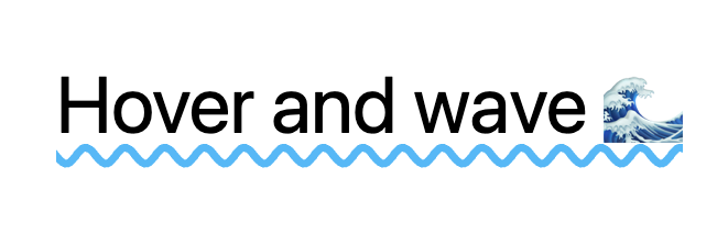
If you don't wish to animate this, you can stop here with this super cool underline effect.
Adding pseudo waves
We have to create a pseudo element. Unfortunately, the underline has no easy way of animating it from left-right.
This means we have to find another way of adding an animation layer. I choose to duplicate the line in a before element. This way, we have more freedom of animation.
The only downside to using the underline effect is that it needs to have text to become visible. So we need to find a way to mimic the original text.
Let's add a data-text attribute to our h1 element.
<h1 data-text="Hover and wave 🌊" class="..."></h1>
Make sure this attribute is in line with the text you are using. Since we want to animate it on the horizontal axis, we need to make sure it renders long enough.
Luckily for us, the Tailwind content class allows us to add multiple elements.
<h1 data-text="..." class="... before:content-[attr(data-text)attr(data-text)]"></h1>
This adds a before element, with the content of twice the data-text attribute.
Making it look like this:

Perfect, precisely what we are looking for.
We can now modify all the underline classes to only be affected for the before: selector like this.
<h1
  data-text="..."
  class="... before:underline before:underline-offset-8 before:decoration-wavy before:decoration-sky-400"
></h1>
However, this will give us three times the text, with two having the underline effect.
Not really what we want.
We can make the main element relative and the before element absolute to solve this.
<h1 data-text="..." class="... relative before:absolute"></h1>
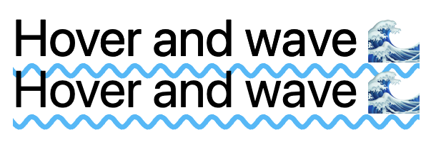
Closer, but we still see the element twice, and it should show on one line anyway...
Let's fix those two issues:
<h1 data-text="..." class="... overflow-hidden pb-8 before:whitespace-nowrap"></h1>
The padding bottom (pb-8) needs to match the offset you used for the underline.
Also, note the whitespace-nowrap to ensure the text stays on one line.
Right now, we have our existing wavy line back, so it's time to animate it.
Adding a wave underline animation in Tailwind CSS
First, we'll have to add this animation in the tailwind config. What we want is a margin-left animation. This animation is not out of the box by Tailwind.
Open up your tailwind.config.js file and extend the keyframes and animation to look like this:
tailwind.config = {
  theme: {
    extend: {
      keyframes: {
        wave: {
          to: {
            'margin-left': '-51%',
          },
        },
      },
    },
    animation: {
      wave: 'wave 1.5s ease-in-out infinite',
    },
  },
};
This creates a new animation called wave, which calls the keyframe animation.
The keyframe animation will animate the element to margin-left: -51%.
I've chosen 51% as this matched the line starting point visually.
It will then loop infinite amounts, so it keeps playing itself.
To add this animation, and only on hover we can add the following class:
<h1 data-text="..." class="... hover:before:animate-wave"></h1>
If we now hover over the element, we can see the whole text moving. Which is not exactly what we wanted. We only want to animate the underline effect.
To achieve this, let's make the text transparent.
<h1 data-text="..." class="... before:text-transparent"></h1>
And there you go!
We created an animated wavy underline in Tailwind CSS. I hope you enjoyed this article. You can have a play around with this CodePen.
Thank you for reading, and let's connect!
Thank you for reading my blog. Feel free to subscribe to my email newsletter and connect on Facebook or Twitter
About the author
I'm a full-stack developer from South Africa 🇿🇦. I love writing about JavaScript, HTML and CSS.
Comments
Join the discussionI don't know Tailwind (yet) but I wonder if there is anything tailwind-specific, or could this be done with plain CSS?
Also a small note. I don't know if it is just my browser, but the codepen doesn't display for me
Thank you for sharing Chris! I'll bookmark this :D
Hi Jorge,
So the main thing about Tailwind is that it's just a wrapper on top of CSS. So anything Tailwind can do, native CSS can also do.
Hmm. not sure about the codepen, It could be the specific browser is not fully supported.



