# Animating a gradient border in CSS
A while ago, I made this cool [animated Multi-colour text effect in CSS](https://daily-dev-tips.com/posts/multi-colored-text-in-css/).
I was re-looking this article and thought we could use some of these learnings to make a super cool animated border effect!
The end result for today will be this cool animated border gradient.
%[https://codepen.io/rebelchris/pen/porBNgg]
## Setting up the basis for a gradient border
Gradient borders in CSS are tricky, as we need to leverage the `border-image` property for this. It's not a super well know property and comes with some caveats.
However, let's give it a go.
We'll first make a single div in our HTML setup.
```html
```
Let's give this div a big width and height so we can have a good demo.
```css
div {
width: 50vmin;
height: 50vmin;
border: 1rem solid;
}
```
This will create a div that is half the width of our viewport. And give this div a `1rem` border.
The next thing we want to add is the actual border-image. We can pass an actual image or set SVGs or a gradient as this gets rendered as an image.
```css
div {
width: 50vmin;
height: 50vmin;
border: 1rem solid;
border-image: linear-gradient(0deg, #12c2e9, #c471ed, #f64f59) 1;
}
```
We should now have our basic border setup, and it should look like this.

Pretty close already. Now we just need to animate this!
Let's use some [CSS variables](https://daily-dev-tips.com/posts/how-to-use-css-vars/) to make the position animatable.
```css
div {
--angle: 0deg;
width: 50vmin;
height: 50vmin;
border: 1rem solid;
border-image: linear-gradient(var(--angle), #12c2e9, #c471ed, #f64f59) 1;
}
```
This introduces a new `--angle` variable. This is nothing that CSS knows about but our own variable.
We can then add a basic animation query as well.
```css
animation: 5s rotate linear infinite;
```
And the rotate animation will look like this:
```css
@keyframes rotate {
to {
--angle: 360deg;
}
}
```
However, nothing will happen!
The value will change, but since it's not a know CSS variable, we need to define it as a changeable property.
```css
@property --angle {
syntax: '';
initial-value: 0deg;
inherits: false;
}
```
And now we got our working animated border in CSS!
## Browser Support
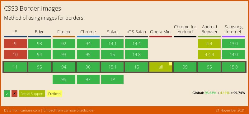
For browser support, we have to technically look at multiple properties. Still, this one below should give you an excellent example of how good the support is.
### Thank you for reading, and let's connect!
Thank you for reading my blog. Feel free to subscribe to my email newsletter and connect on [Facebook](https://www.facebook.com/DailyDevTipsBlog) or [Twitter](https://twitter.com/DailyDevTips1)