
A look at the ch CSS unit

A while ago, I wrote about the [Tailwind typography plugin]. I was pretty blown away by how easy, and readable big text elements become.
After researching their applied styles, I've noted the prose class actually goes off on the ch unit.
.prose {
    max-width: 65ch;
}
This is based on the width of the 0 character for a specific font! Yes, so changing the font might affect this.
And the result is that it actually makes a super readable width.
Seeing the ch unit in action
Let's give this a try and make a demo with it.
For the HTML, we render two sections with different classes to represent the different fonts.
<section class="georgia">
  <p>copy</p>
</section>
<section class="helvetica">
  <p>copy</p>
</section>
Let's add some basic styling so we can see these two sections under each other.
body {
  min-height: 100vh;
  display: flex;
  justify-content: center;
  align-items: center;
  flex-direction: column;
  margin: 0;
}
section {
  display: flex;
  align-items: center;
}
p {
  max-width: 65ch;
}
.georgia {
  font-family: Georgia, serif;
}
.helvetica {
  font-family: helvetica, sans-serif;
}
As you can see, we use the same max-width value for both elements, but once we see the end result, the one is bigger.
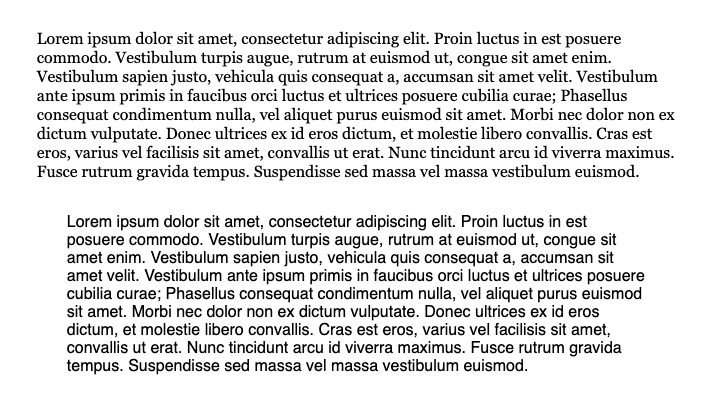
The image above shows that the top element rendering the Georgia font is wider.
This is caused by its 0 (zero) being wider than the Helvetica font set.
You can also have a play with it yourself in this Codepen.
Extra reading
Shawn wrote this great article using this ch unit and just 100 bytes of CSS to make anything look great!
Here are his magic bytes:
html {
  max-width: 70ch;
  padding: 3em 1em;
  margin: auto;
  line-height: 1.75;
  font-size: 1.25em;
}
You can read the full article on Shawn's blog.
To wrap this up, the ch unit is super powerful yet a bit unpredictable as the size might change.
I really like it, as I don't do static pixel design anyway, but I'm looking forward to hearing your thoughts on the ch unit!
Thank you for reading, and let's connect!
Thank you for reading my blog. Feel free to subscribe to my email newsletter and connect on Facebook or Twitter
About the author
I'm a full-stack developer from South Africa 🇿🇦. I love writing about JavaScript, HTML and CSS.
Comments
Join the discussionNo comments yet. Be the first to comment.



