5 amazing Chrome accessibility tools you didn't know!

I think we are all aware we as developers are responsible for making the web more accessible.
With accessibility, we mean making websites that are designed and coded so people with disabilities can use them.
I, for one, never know how to start? I keep hearing people shout, "MAKE YOUR WEBSITE ACCESSIBLE".
Ok, but how?
These 5 Chrome dev tools will help us with that.
Opening Chrome dev tools
We are using Chrome dev tools for all the below five items, which can be found using the following shortcuts.
Mac Cmd + Shift + C or Windows: Ctrl + Shift + C.
1. Accessibility inspector
The first and perhaps most obvious one is the accessibility inspector.
This will show us mainly the ARIA properties of certain DOM elements.
To access this menu, we need to open Chrome dev tools and right-click an element. It's under the inspect tab but can be hidden under the extra options.
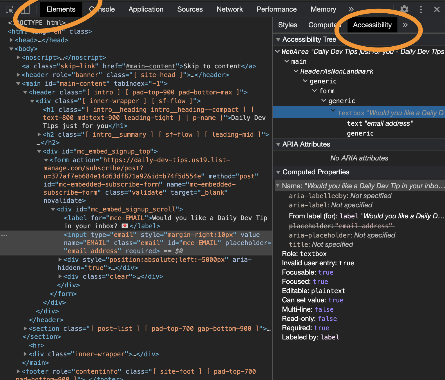
If you want to learn more about creating good aria labels, look at this article on ARIA.
2. Vision emulator
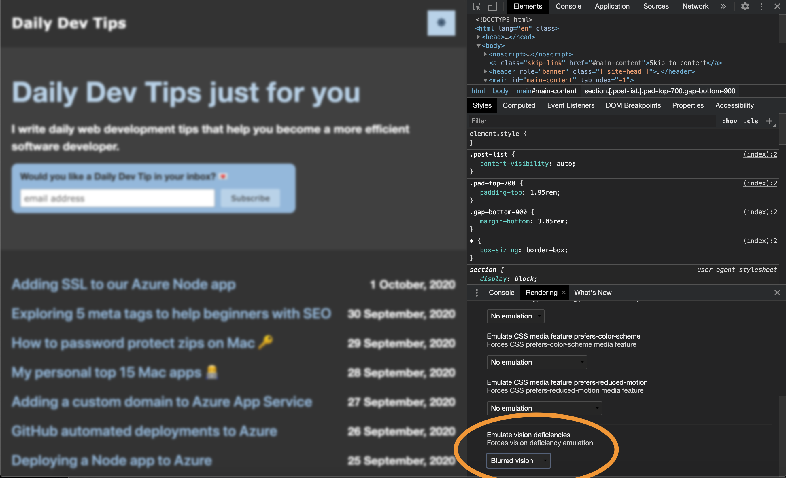
Did you know we can emulate vision deficiencies?
You want to use this function to make sure people with vision deficiencies correctly see your website. It might be that people with a certain vision disability.
Open up the Chrome dev tools. Then we click more tools and choose, Rendering.
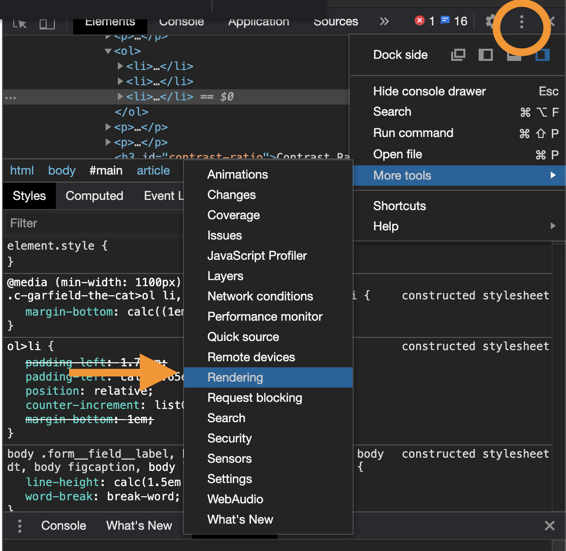
Scroll down to the bottom on the rendering tab and find "Emulate vision deficiencies".
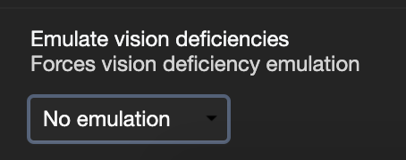
We can filter on the following:
- Blurred vision (People who can't see sharp)
- Protanopia (Color-blind, shades of red/greens)
- Deuteranopia (Color-blind, green blind)
- Tritanopia (Color-blind, blue, yellow shades)
- Achromatopsia (Total color blind)
This will look as follows:
Note the image below shows a blurred vision image!
3. Lighthouse
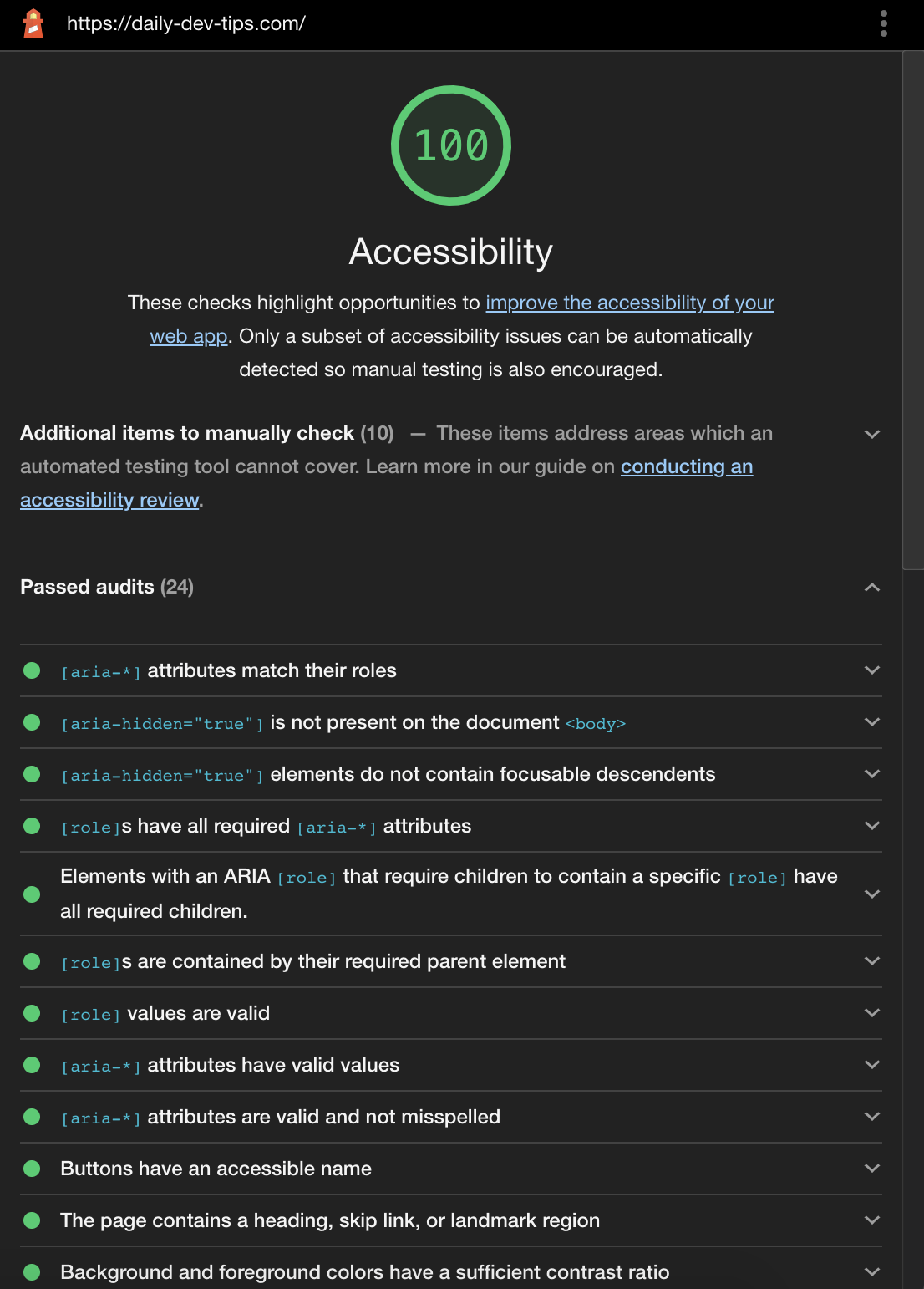
Obviously, we have Lighthouse, which nowadays has a whole accessibility tab build in.
Open Chrome dev tools and click on the Lighthouse tab. We can then check the accessibility checkbox.

We then get a report like this.
It checks on things such as:
- Aria definitions
- Role attributes
- Contrast ratios
- Lang attribute on HTML
- Tabindex on forms
- Alt elements
- And many more!
4. Contrast ratio
A big thing when it comes to accessibility is contrast. We also saw this in our vision deficiency item.
Chrome has a quick way to show contrast in a certain element.
To open the Contrast ratio, we need to open Chrome dev tools. Then inspect a text element and find a color box. Click the little color box and choose the pointer element.
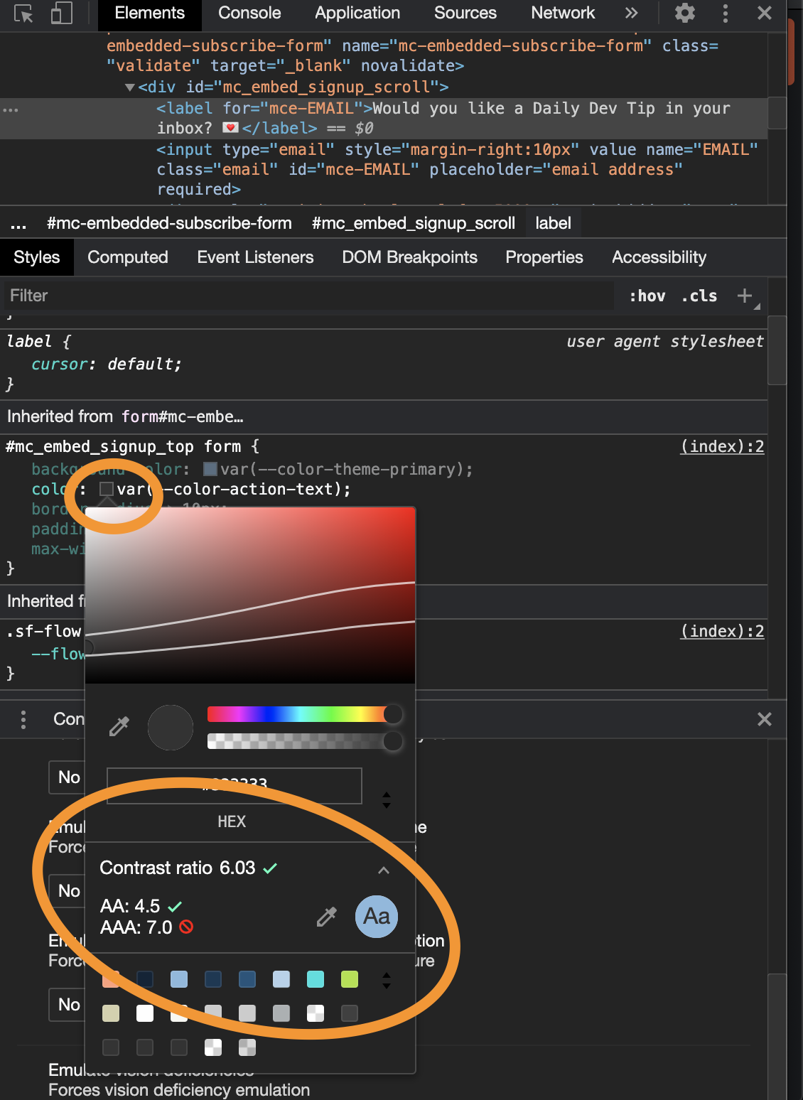
You might think ok, but what does this mean?
- The first value is your current contrast ratio
- The second value is the minimum contrast ratio (AA)
- The last one is the enhanced contrast ratio (AAA)
You can change the colour and see if you can enhance your contrasts.
5. Inspect element tooltip
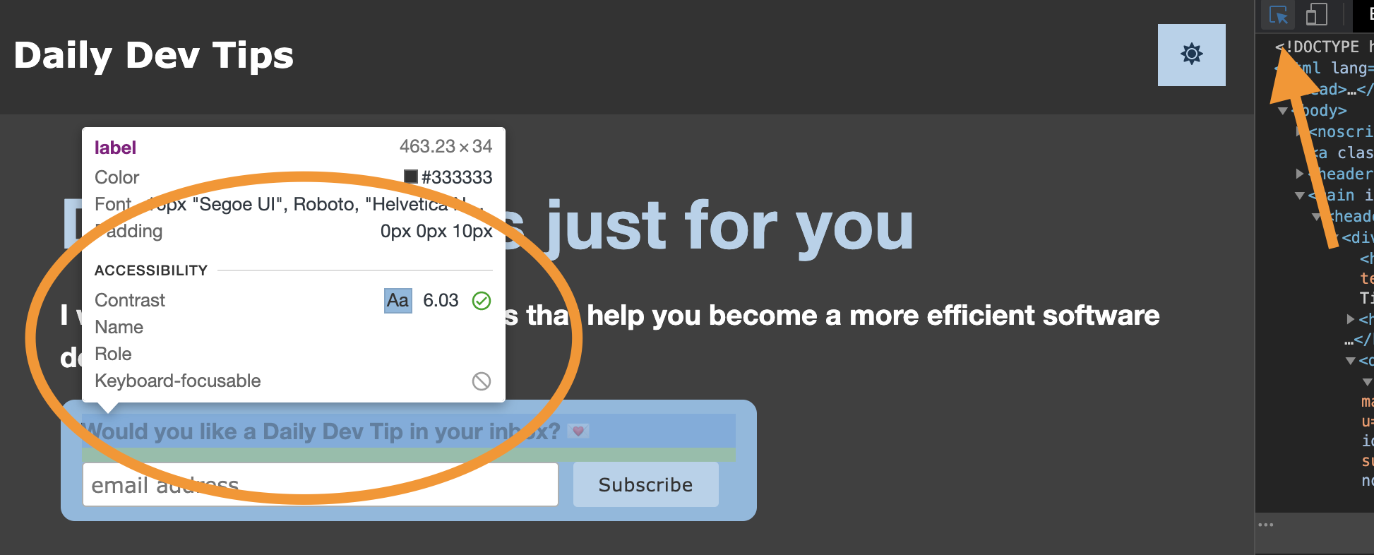
Another great tooltip which combines many of the above is actually the inspector tooltip.
We can use the inspector tooltip by opening Dev tools and selecting the pointer icon.
Then we can hover an element and see with one quick glimpse what the contrast is the role, and if it's focusable by the keyboard.
Thank you for reading, and let's connect!
Thank you for reading my blog. Feel free to subscribe to my email newsletter and connect on Facebook or Twitter
About the author
I'm a full-stack developer from South Africa 🇿🇦. I love writing about JavaScript, HTML and CSS.
Comments
Join the discussionThanks so much!
This helps a lot, especially for lighthouse.
Most people have problem with these because they are trying to comply with google page insight speed scores lol
I do seo lol
Nice! It's a weird game we are playing with google. I don't always agree with what it suggests or it's just not feasible but for the accessibility point, it's spot on!
oh Wow! Thank you for sharing. This would be a good reference for accessibility.
How do you mean would? I hope it is at least a good starting point for people 🙇♂️
Another Awesome Article Chris 😀
Thanks for writing this up (learned some new tools to make websites more accessible 💪).
Thanks Jatin Rao glad you learned something new. 🤩
Awesome Skay glad you like it! I was looking for these tips myself, so hope they help you.
Very useful article. I only knew about Lighthouse among these.
Bookmarked. Thanks.
By the way, the contrast ratio doesn't show up on my browser. Which version of chrome are you using?
Hey Bhanu Teja Pachipulusu Awesome! Glad to helped you with these, I'm using Chrome Mac Version 85.0.4183.121